Websites
What Great Medical Spa Website Design Actually Looks Like
The design, content, and technical qualities that separate a medical spa website that books consultations from one that only looks good.
6 min read
A beautiful website is a starting point, not a finish line. For a medical spa, the site has two jobs at once: it must reflect the quality of the experience you provide, and it must help a careful, research-minded visitor feel confident enough to book. The best sites do both without compromise.
Design that communicates trust
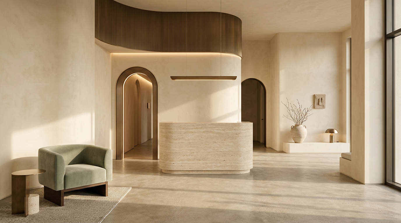
Prospective clients judge credibility within seconds. Generous spacing, refined typography, real photography of your environment, and a calm visual rhythm all signal care and professionalism. Stock imagery that looks interchangeable with every other practice tends to do the opposite.
Treatment pages that answer real questions
Most visitors arrive with a specific treatment in mind. A dedicated page for each treatment should explain, in plain language and with clinical review:
- What the treatment is and what it is commonly used for
- Who may be a good candidate, and who may not
- What to expect before, during, and after
- How a consultation works and how to book one
A mobile experience built first
Many visitors will first see your site on a phone, often from a search or social link. Tap-friendly buttons, readable type, fast loading, and a booking path that is always within reach matter more than any desktop flourish.
Technical performance you can feel
Slow pages lose visitors and can weaken search performance. Optimized images, modern frameworks, and attention to Core Web Vitals keep the experience smooth — and support the visibility work that brings people to the site in the first place.
Bringing it together
The strongest medical spa websites treat design, content, and performance as one system. If you are unsure where your current site stands, a structured review is a useful first step.